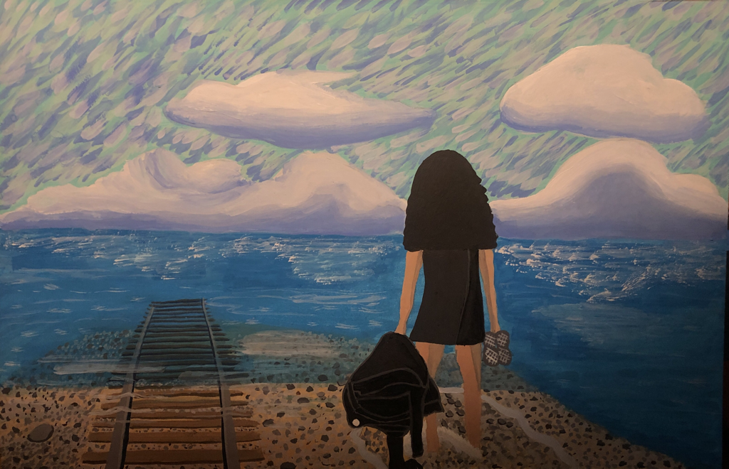
Illustration
|
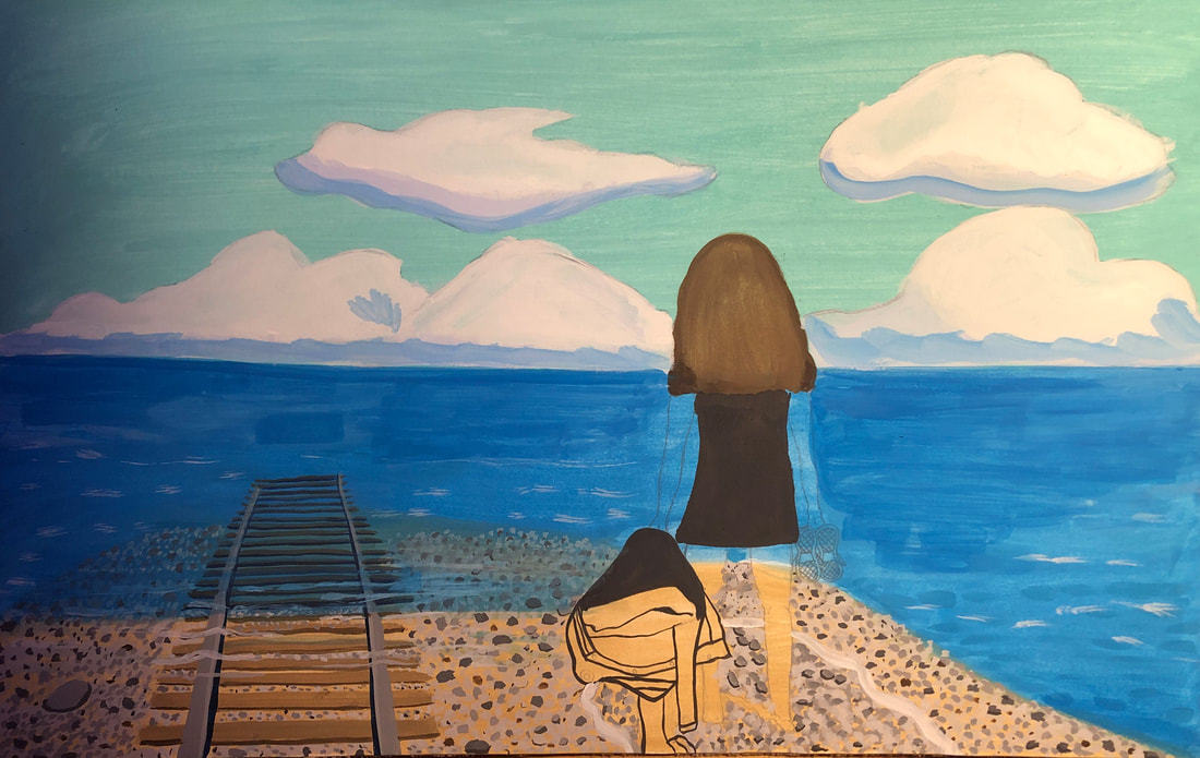
Title: The Future Just Ahead
Size: 31.1cm by 25.4cm Medium: Gouache on illustration board Completion: March 2023 |

|
|
Exhibition Text
The Future Just Ahead takes inspiration from and appropriates still from Hayao Miyazaki's Studio Ghibli film, Spirited Away and inspiration from paintings of Claude Monet. It demonstrates the hope that people have during difficult personal struggles and what could lie ahead of them in the future. It is inspired by one of my own friend's stories of the dream she had when she was bullied as a child: she hoped that high school would be different and luckily, her childhood hopes became a reality.
Inspiration
Artist in Focus: Hayao Miyazaki
|
Miyazaki has been something that I always found so calming and it's one of my favorite illustration groups because their scenes always look so beautiful, even if the meanings in the films are deeper or more sinister. The stills in the movie Spirited Away really captivated me and inspired me to make a piece based on them because of how moving they are and their bright colors. The way that the colors of blue and red/brown contrast is what made me feel so captivated by the film stills. This still was what I thought of when I heard illustration, so I knew that I had to include the film into my piece somehow. I would pull themes of loneliness and hope into my piece because of the symbolism in the film. The contrast of the colors and the stills' compositions and colors would be appropriated to make my illustration with added inspiration from impressionist techniques.
|

Still From Spirited Away
|

Still From Spirited Away
|

Still From Spirited Away
|
Artist in Focus: Claude Monet
|
To begin, the concept and origin of impressionism itself was relevant for what the message behind the final artwork would be (which is discussed in the planning portion of this webpage). Impressionism was called what it is because artists and critics thought that the artworks in this movement looked like an impression of a scene, and not a realistic approach, which was far more common compared to the art of the time. The way that I see impressionism is in a way where it is almost child-like, which appeals to illustrations, or dream-like which is relevant to the meaning of this illustration. Even though Miyazaki did not have an impressionism approach to their stills, I thought that mixing the two artists' styles would benefit the purpose of the piece.
When I thought of the bright colors that were in Spirited Away and similar artists in impressionism, I immediately thought of Monet. While I was browsing his work, I came across Cliff Walk at Pourville. I noticed that the ocean/landscape had the same impact on me as the stills from Spirited Away did. The vibrant colors were very captivating and the painting looked appealing. The contrast of the dull gray water against the bright blue sky and the green cliff was similar to the way the train scene in Spirited Away in contrasted the dark train colors with the blue sky in the background. I thought that this piece could impact the way that I'd structure the stills. In addition to the Cliff Walk of Pourville, I came across Bathers at La Grenouillère when I was looking for pieces to incorporate technical inspiration to my illustration. The way that line was used in this artwork intrigued me, especially the lines to give off the impression of water. Since most of my illustration would include water or the sky, I wanted to add this style of line to my artwork because of how simple yet effective the line was. The Cliff Walk at Pourville inspired me to create contrast in my illustration through color and Bather at La Grenouillère inspired me with the technique and style of line. |

Cliff Walk at Pourville

Bathers at La Grenouillère
|
Planning and Experimentation
To plan, I had started looking into ways that I could pull themes from the inspiration of Miyazaki's Spirited Away and the stills I chose for my inspiration with my friend. I searched up what the character No-Face, the black ghastly figure sitting next to Chihiro (the girl with a striped shirt), represents. I found that he symbolizes the Chihiro's fears of loneliness, abandonment, and identity. When we found that out, my friend and I had a discussion about how she used to get bullied in middle school and how lonely and isolated she felt during that time. She also mentioned that this was the reason she was excited for high school, as she was hopeful of new beginnings. This was enough background for me to make this illustration about her.
|
To experiment, I had to see how gouache paint works with different mediums since it was a medium that I had never used before. I was experimenting with how gouache interacts with liner, as I planned to use liner over the gouache in the end to create a more illustrative/cartoon look to the characters as Chihiro had that look to her. To the right, you can see how I was experimenting with different methods of using the gouache and liner and my realizations.
|

|
|
In addition to experimenting with gouache and liners, I wanted to see how true to their colors the gouache would be once dry and what colors would make the most sense to closely resemble those of the still in Spirited Away. Of the gouache paints that I had available to me, I found that sky blue would work for the sky, but I found some difficulties for the water. I tried having cerulean blue on its own at first for the water, but as pictured on the right, it was too dark compared to the water in Spirited Away so I would end up mixing a bit of the sky blue in the cerulean blue for the base of water for this panel. In the end, these colors would only be bases of color for the impressionistic style of the final edition of the illustration. In addition to the blues, I would use burnt sienna and a bit of burnt umber for the wood on the train.
|

|
|
At this point I wanted to attempt to tackle the challenge of clouds. This would prove to be a test of patience, as gouache will reactivate no matter how long time has passed with even the slightest bit of water. Luckily, this wouldn't be too much of a problem since I was going for the impressionist look with this project so it would be easy to clean up clouds that looked like the one pictured on the right. Fortunately, I'd look at my painting from Art History that was a study of Degas' Blue Dancers that'd help me remember how I completed the painting and use those same techniques for this illustration.
|

|
|
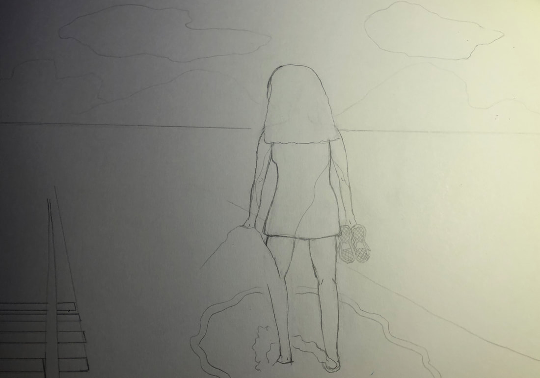
To plan for drawings on the illustration board, I took pictures of my friend and made a cartoon-style character based on the picture. I'd make this sketch in my sketchbook and not the actual board, just in case I wanted to tweak it later. Then I took No-Face and sat them next to each other like in one of the stills. A difference between the inspiration and the drawing was the expressions that the girls had. Chihiro looks uncomfortable while my friend looks happy. This is intentional, as she wasn't really nervous on her way to becoming a high schooler since she had so much hope, while Chihiro was scared to travel on her own. At this point, I was confident enough to start working on the illustration.
The contrast in panels would be my friend at one stage in her life (a middle schooler) on her way (symbolized by the train) to high school which is symbolized by the desolated railroad tracks and her looking forward. |

|

|
|
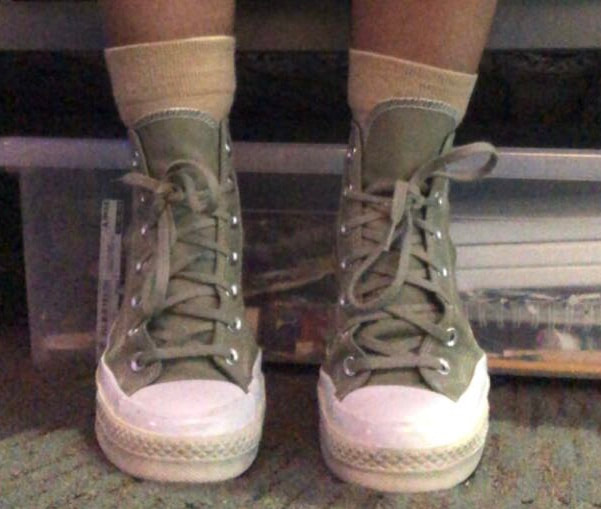
A problem I came across later on was not having a picture I needed to make a drawing, so to prepare for that, I had to take a picture of my own to improvise and make up for it. I'd use this as a reference in the second panel of the illustration.
I also realized that I didn't capture a picture of her feet placement so I improvised and used a photo of myself where I had replicated Chihiro's pose. |

|
|
Process
|
To start, I had gotten an illustration board and cut it approximately in half with a blade. This was to make an impression of two different scenes at around the same time which would align with my ideas that I had wanted to implement into my illustration since the planning stage.
Then, I began to make the drawings for the background of the illustration. To do this, I made sure to pay attention to the color shifts of the still of the train scene. Every time that I saw a color change, I'd make a break with a line to indicate it. It ended up looking very similar to the original still. |

|

|
|
Then, I began to make paint in the base color for the sky, sky blue. I knew I was going to add multiple layers to this initial layer, so I knew I had to let the gouache dry before adding another layer. I also had to remember to add only a little bit of water when adding more layers onto the first, as the first layer could reactivate with the water. At this point, adding the second layer already made the handles no longer visible, so I figured that I'd just add them later.
|

First layer (handles are still visible)
|

Second layer (handles no longer visible)
|
|
Next I moved on to adding the crude layers of the train seats using burnt sienna and a bit of burnt umber. I'd add more layers carefully later on but this was just getting colors out of the way, creating contrast with colors the way that Miyazaki did.
|

|
|
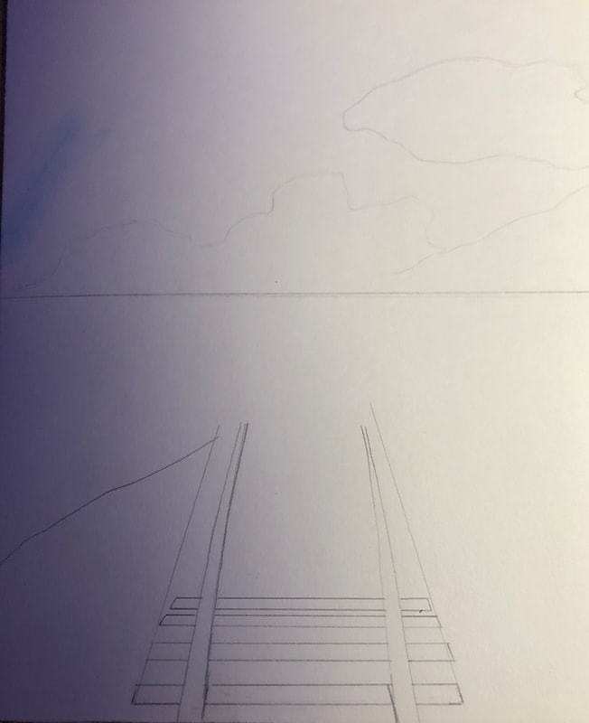
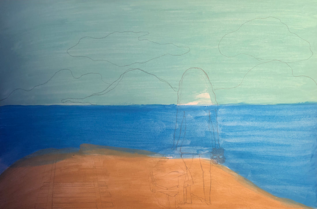
At this point, I wanted to work on the drawing for the other panel. I began with the sky parting with the water. Then I established the proportions of how tall the figure (my friend) would have to be compared to the rest of the panel in order to resemble the still.
When I was drawing the railroad tracks, I had a difficult time trying to figure out the perspective aspect of drawing them. I felt that it was difficult to do this with pencil and I could just make the railroad tracks later with the paint so I held off on that and left it for later. I thought that having the color and shadows for the first couple of boards of the tracks could guide me with the rest of the boards. |
When it came to drawing my friend with her holding her jacket, I realized I didn't get a picture of her with it so I improvised and took a jacket of my own to make the next marks and lines on the illustration board.
|
|
|
Next, I added the first layers of gouache to the second panel. I used a more green toned base layer for the sky and the same cerulean blue for the water. I used a tan named for the sand. When I noticed that I was going to lose the boldness of the graphite so I went over it again. I didn't want to risk not being able to see the details in the illustration later on.
|
|
|
|
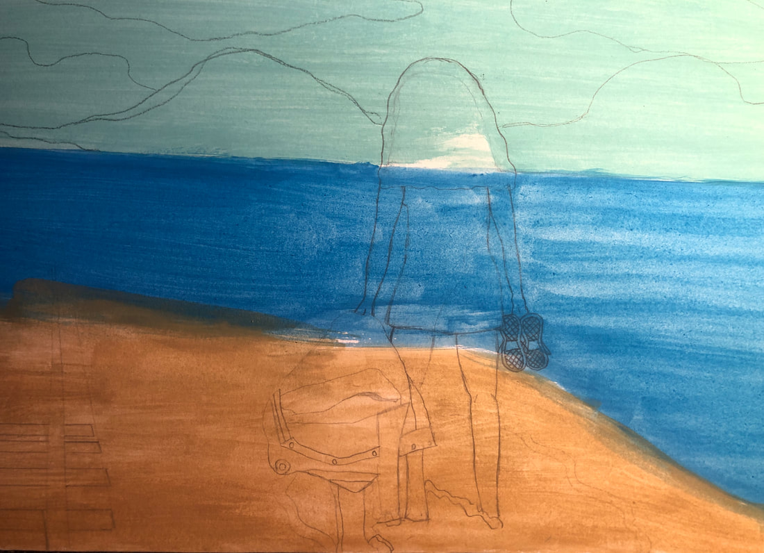
Next, I got some burnt umber to create the base of the railroad tracks and the hair. I knew the hair was going to have to be way darker at some point but I wanted to have the brown base for the highlights I'd have for her later. I was preparing in advance so there wouldn't be a risk of lifting a black layer, which could get very messy.
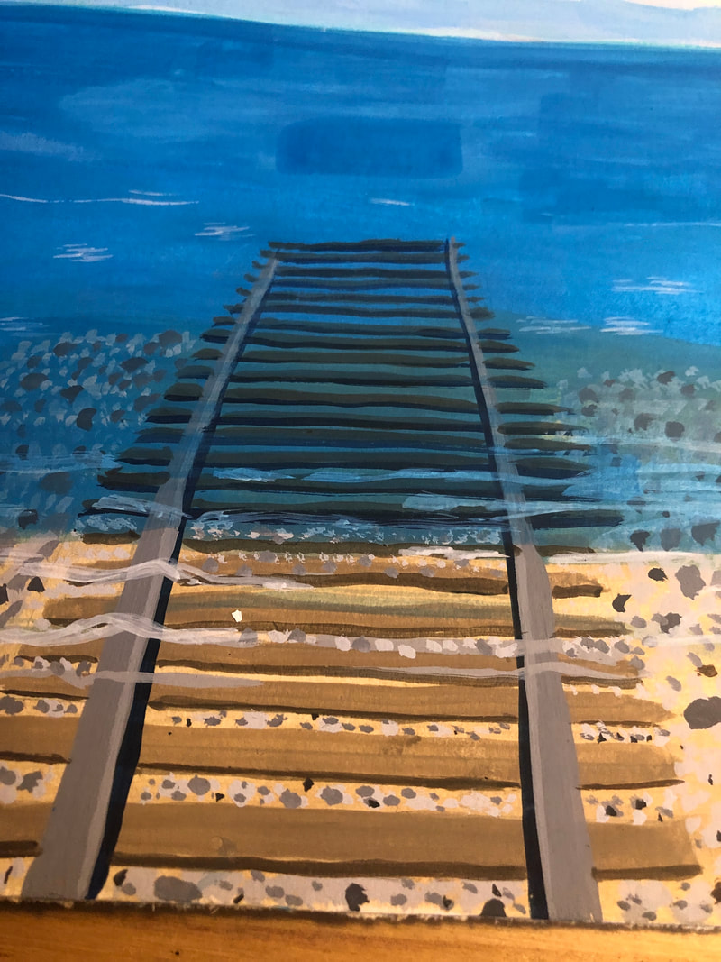
On the far right, is the completed railroad track. I found that I was right and thought it was easier once I had color on the illustration board rather than trying to guess how far apart the railroad track's boards would be and thick or thin they'd have to be to make sense with the perspective. This exercise was beneficial for me. |
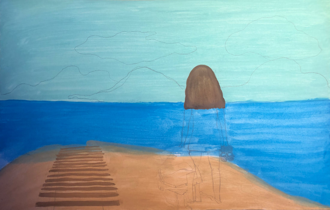
For the railroad tracks on the right, I had to make them look like they were submerged underwater. To achieve this effect, I had to use a Prussian blue to make the shadows of the boards. I had used the same burnt umber for the boards, and went over it with a wash of the cerulean blue, being careful to not lift up any of the brown.
|
|
|
For the stones, I had made several shades of gray in order to get varieties of rocks like Miyazaki had. Then I began to work on the jacket. I had made outlines of it so that I had an idea of where the boundaries of everything were. I thought that I was going to make some artistic choices like getting rid of the red badge with letters and replacing it with something that represents my style more like a badge with a star. This would be something I'd do later. Below is what the panel would look like after I filled in the base of the clouds.
|

I'd come back to fixing the water, finalize the clouds and sky, and fill in the skin and hair. That would be the rest of this panel, but I'd end up going back to the first panel while this panel was drying.
|
|
With the first panel, I'd begin to start finalizing the layers of color and bring the piece to become more inspired by impressionism visually. For the sky I used multiple shades of blues to create a look that was similar to the Cliff Walk at Pourville by Monet. I'd try to replicate the tiny, thin, and quick strokes that he used to create this illusion of sky. For the water, I'd use more technical inspiration from Bathers at La Grenouillère. I noticed that the lines were thicker, yet still quick. I also noticed that the strokes seemed to be more controlled by Monet in that painting. This is replicated in the water with more shades of blue, some from the sky and others not. I also added a drawing of No-Face onto the board. I was confident in the water and sky to do this now, although I knew I wanted to fix up the clouds so I did that as well. I also drew my friend sitting next to No-Face, which ended up becoming a challenge because I also realized that I had no pictures for reference of her feet placement. I tried to recreate the pose that Chihiro had made as close as possible. Then I used the photo as a reference for the drawing. I would draw on the shoes and feet later. My focus at this time was to start on making the characters come to life with the paints.
Since the colors of my characters, No-Face and my friend, were going to be similar in terms of garments and the ghost's body, I went right along and painted them black in the areas they needed to be. Then I went on to tackle No-Face's mask with the white and purple. This would prove to be more difficult than I thought because of the layering that I'd have to do because I had other colors on the illustration board before the sketch went onto it. This meant that I'd have to wait for a layer of the paint to dry before adding the next layer which was very time consuming. In the mean time, I'd work on making the skin tones for the figure meant to represent my friend. To do this, I would end up using a yellow, burnt umber, and white. I used my color theory knowledge to make this skin color almost immediately which helped make this process easier. I filled in her skin on both panels with this color. I also added an outline with gray on my friend's jacket in order to make the distinction of where sections of the jacket start and end. |


|
|
Then, I added drew and painted in the shoes which I also had to take a reference photo for since I didn't get a shot of her legs and feet. I had to be careful with this part since the shoes were so small. Precision was important because I was using black for her shoes so I didn't want to mess up and have to cover it up with the brown that was lighter.
Then, I began to make some improvements to the sky on the second panel and I tried to keep the Monet look to the piece. I made different shades of blue for the sky and kept the brushstrokes in a feather-like fashion. The making of the clouds was a bit more difficult to do because I needed to make transitional shades make the clouds look similar to those of Monet.
Lastly, added finishing touches to both illustrations and added liner to the figures. This would complete my process with this illustration.
|


|
Reflection
Overall, I think that this piece could've been better. I'm not the most proud of this piece, but it is definitely something that I could improve upon. I feel that the ideas and meanings of these illustrations were definitely strong, but the application of skill was lacking a bit. Also, from the start I wasn't too confident about who I'd use for my inspiration as I couldn't find any ties with most artists and my themes. Looking back on it now, I could've taken an art style and made the meaning my own. If I had thought about this sooner, I'd probably have chosen David Shannon's illustrations for the book "A Bad Case of Stripes". I loved his take on surrealism with illustration but I wasn't too sure about the themes in the book. In addition, I believe that working with gouache is probably not the best for attempting to make a sort of impressionist piece. I feel that the wet-on-wet strategy works very well for impressionism, but the limitations of gouache didn't really work for this. If I could do it all over again, although the piece would lose some meaning, I think that sticking to purely the Miyazaki style would've been better. I also wish that I hadn't just appropriated the scenes and add some aspect of my own ideas onto them. I feel like this would've been a good style to explore and make my own scenes with that would convey the same message. On the other hand, this allowed me to explore a new medium and allowed me to understand the properties of it, too. I know what works with this medium and what doesn't. I know that it's best to stay with flat colors and not try to blend them. Gouache seems to work best for pieces that are smaller, as this medium dries quickly. I learned a lot about gouache and I'm glad that this was a learning experience for me and made me expand my knowledge on new mediums.
Critique
Artist: Claude Monet
Bathers at La Grenouillère
Cliff Walk at Pourville
|
Artist: Alexandra Medina-Serna
Panel 1

Panel 2
|
Artist: Hayao Miyazaki
Still From Spirited Away
Still From Spirited Away
|
Comparisons with Monet
Contrasts with Monet
|
Comparisons with Miyazaki
Contrasts with Miyazaki
|
Connection to ACT
1. Clearly explain how you can identify the cause effect relationship between your inspiration and its effect on your work.
Miyazaki's Spirited Away's stills have been appropriated to fit my themes and their contrast of colors is also seen in my work. Monet's work impacted the techniques of line in my illustration. Both artists have made aesthetically pleasing artworks that were used to help make my work.
2. What is the overall approach the author has regarding the topic of your inspiration?
The writer, illustrator, and director of Spirited Away, Hayao Miyazaki, was very adamant about these topics. He freely wrote about them and wanted them in his film for a reason. On the other hand, I am not sure if Monet would think the same way based on his paintings.
3. What kind of generalizations and conclusions have you discovered about people, ideas, culture, etc. while you researched your inspiration?
I thought that lots of illustrators would have the shared theme of hope throughout their artworks and projects.
4. What is the central theme around your inspirational research?
The theme around my research started off based off of aesthetics first and ended up being about the pursuit of fulfilling a dream and hope.
5. What kind of inferences did you make while reading your research?
I thought that I wouldn't be able to make many connections between a historical artist and a modern artist.
MLA Citations
Blautoothdmand. “Why The Train Scene in Spirited Away Is My Favorite Work by Miyazaki.” Blautoothdmand, 27 Oct. 2017, blautoothdmand.wordpress.com/2017/10/17/why-the-train-scene-in-spirited-away-is-my-favorite-work-by-miyazaki.
Luster, Joseph. “Spirited Away Fans Cause Trouble With Ill-Advised Anime Pilgrimage.” Otaku USA Magazine, 9 July 2020, otakuusamagazine.com/spirited-away-fan-pilgrimage-trouble.
Dobay, Adam. “Why Haku Tells Chihiro: Don’t Look Back - Follow the Moon Rabbit.” Follow the Moon Rabbit, 26 July 2021, www.followthemoonrabbit.com/why-haku-tells-chihiro-dont-look-back.
https://artsandculture.google.com/asset/bathers-at-la-grenouill%C3%A8re-claude-monet/KgF6Xfm8i8pgSA
“Bathers at La Grenouillère - Claude Monet - Google Arts and Culture.” Google Arts & Culture, artsandculture.google.com/asset/bathers-at-la-grenouill%C3%A8re-claude-monet/KgF6Xfm8i8pgSA.
