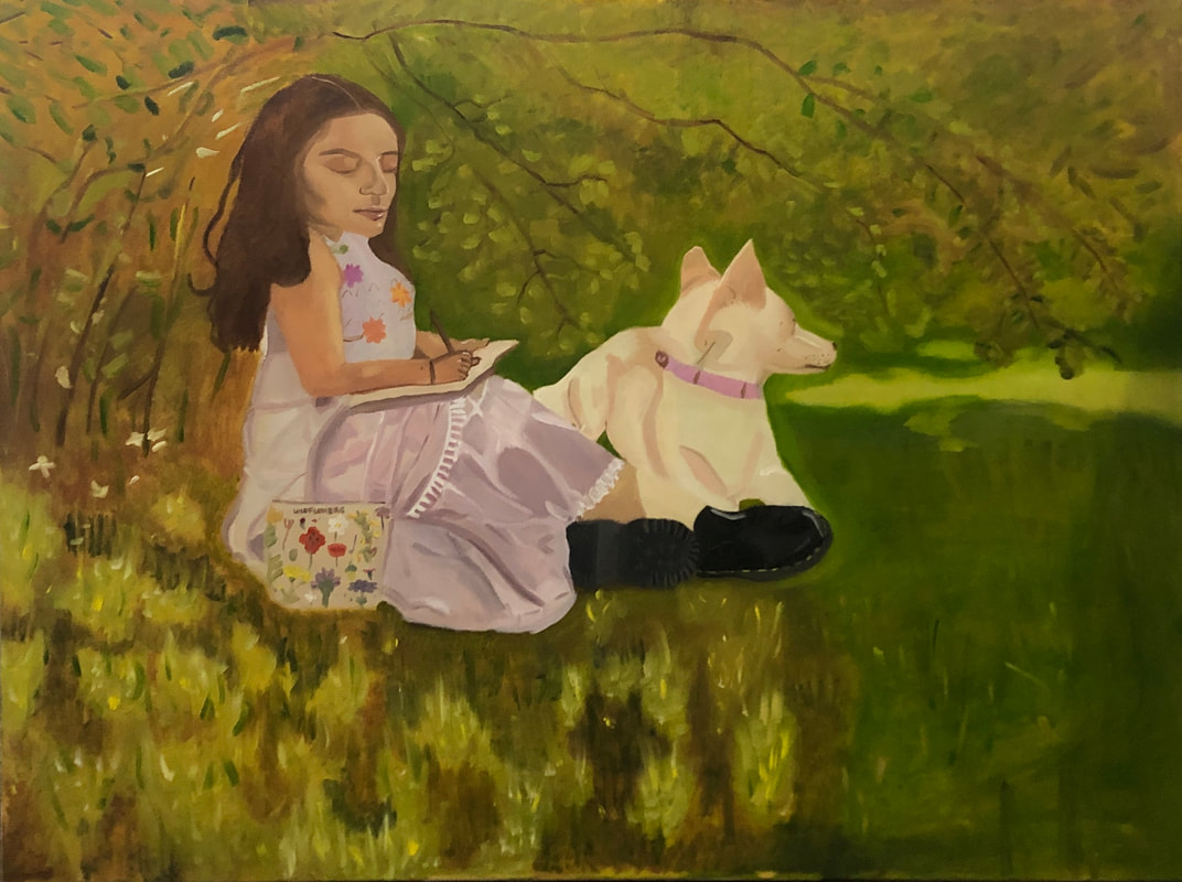
Self-PortraitTitle: Springtime with Alex and Luna
Size: 3ftx4ft Medium: Oil paints on stretched canvas Completion: April 2023 - ___ 2023 (going to fix) Exhibition TextSpringtime with Alex and Luna is inspired by Claude Monet’s oil painting Springtime. The inspiration behind his own piece was taking a moment in time that not everybody finds elegant, and turning it into a pleasant artwork. This made me want to explore this topic and I tried to do the same by inserting myself into this painting.
|
|
Inspiration
|
For this project, I would insert and replace myself with the figure in the painting Springtime by Monet. In the painting, you see a woman who is sitting on the ground and reading a book. For my painting, I'd be painting myself drawing, since it's an interest of mine and is similar to the painting.
What intrigued me about this painting was the contrast of dark and light in the painting and the feeling of peacefulness that exudes from it. The way that the brushstrokes look makes for a soft texture that is presumably achieved by the wet-on-wet technique, which I would implement into my own painting. As I further researched the meaning behind this painting, I found that Monet made it because he had seen the beauty in everyday life, something that many artists alike have an eye for. It is something that is rather important to myself as well and I thought that if I were going to make my first painting about myself, then it should reflect not only my appearance but the mentality I have towards art and scenes that others take for granted. Another thing that I thought was important was to include aspects of my culture into the painting as I have done in the past with my Perceptions of Identity painting. Instead of the pink dress that the woman has on, I'd use a traditional Mexican style dress to do this. |

Springtime - Monet
|
Another aspect of this painting that I liked was the way that it showcases a real scene. It is not from imagination and it captures movement with the highlights in the grass and the bushes above her that look like they're blowing in the breeze. I knew that I wanted to take pictures outside with movement like this so I could have that in the painting.
Planning
The planning for this painting included taking pictures of myself for the sketches of the drawing that I'd make to prepare for the resulting painting.
|
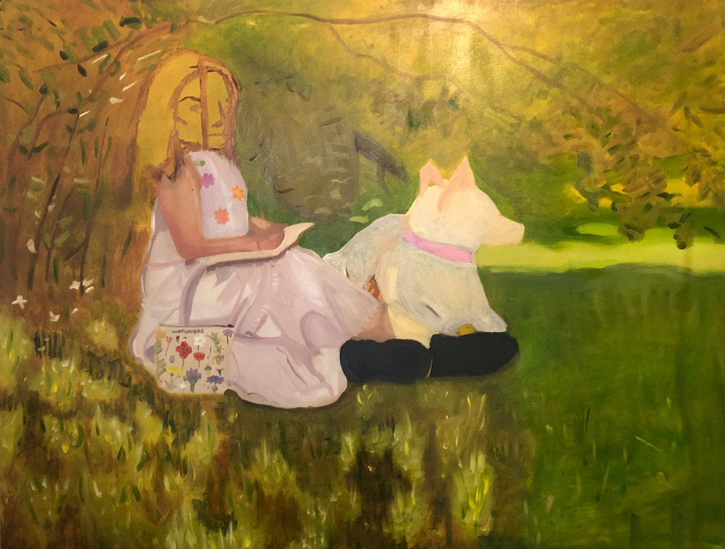
When I finished taking my pictures, I decided that I wanted to make a collage of the pictures in order to make one picture that'd be painted onto the canvas. The reason I did this was because I had liked certain aspects of the pictures but there were things I wanted from other pictures onto my final work. To be specific, I wanted to have my dog looking a certain way in the final painting, but I didn't like how I looked in that picture. This prompted me to make a collage where I'd take the section of the dog that I liked how she was looking off into the distance (two) and roughly place it onto the picture of myself that I liked the most (one). To create the collage, I went onto Photopea and I added the aspects that I liked about one picture to the other. I used the lasso effect and used the refine edge tool to make the section of the picture look a little cleaner which is seen in image three.
|

1
The reason I chose to make this decision of adding my dog, was because I had wanted to make this more personal to me. My first self portrait wouldn't be complete without her.
Why I liked picture 1 was because the pose was the most similar to the reference from Monet. I also liked the way that my hair looked and the pose looked most realistic and relaxed than in picture 2. |

2

3
|
After I took pictures, I decided to make a plan of how to make my painting. I knew I was going to start with a wash of burnt umber and burnt sienna and then make the outline of me, my dog, and the tree that's behind me. Then I'd start to make out the colors and values with colors that are similar to the ones in the picture. After that, I'd start laying down colors and matching the colors better to what they'd be in the final piece. Then, I'd add more detail with highlight and fine tune the painting, and then I'd be done.
Process
To start my process, I began to make my canvas. I took some 4 foot and 3 foot stretchers and began to put them together. Then, I took a roll of canvas and cut around 4 feet by 3 feet worth of canvas with some extra centimeters so I could wrap it around the stretchers. Then, I wrapped the canvas around the stretchers and I gessoed the canvas twice, waiting for the gesso to completely dry before adding another layer. This process of making the canvas is the same process I used for making my canvases for the last paintings I've made.
|
To start the painting, I had used a mixture of a thinned burnt umber and burnt sienna as a wash to make a base layer of the painting. I do this in order to not make my perception of hues and colors be altered by the background being white.
|

|
|
Then, I was ready to paint the background and guidelines for my painting. To do this, I mixed some greens and yellows along with blue when I had to make darker values for the background and I mixed some burnt umber and burnt sienna and began to go off of the reference picture I produced onto the canvas since I didn't have a projector to most accurately make the sketch of myself and my dog.
The background was created by using a 2 inch brush and was executed with quick brushstrokes and blended the same way, just cleaning the brush every few strokes, as a way to make a base of the colors and values of the painting. 

Next, I wanted to create the skin tones that I would use for the arms, as in the picture, are very orange and red toned. I tried to pay attention to shadows and highlights as well when filling in the arms.
Additionally, I also filled in the base color for the bag next to me. I wanted to add detail to it so I tried to recreate the flowers on it. This was probably my favorite part of this process as this was its own little art piece and painting inside of another painting. The inception felt very fun to me as the flowers didn't have to look overly detailed since this wasn't a large portion of the project and the painting is in the impressionist style. As seen in the photo to the far right, I also painted the sketchbook and the pages inside of it. The shadow underneath it wasn't made with a black but the burnt umber from before. I also made sure that the shadow was soft so that it could be indicated that it wasn't a harsh edge but a shadow like I intended it to be. |

Then, I started to fill in the dress by making a base color that was a white with some blue and purple tones. I applied it onto the painting very gently, as the other oil paint layer underneath it was only semi-dry.
The estimated ratio for the white paint compared to blue and red as a joint color (purple) is 8 parts white and 1 part purple for the base of the dress. Then, I began to create some dimension to the dress and I painted in a base layer for the shoes. I created the darker colors and values of the dress by using more purple than white. I used a range of values for this part of the process to try to make the dimension in the dress. I made sure to keep using short brushstrokes like impressionist artists. Then, I also created some part of the design for the top of the dress with the multiple colorful flowers. This process was fairly short as I made only a couple of colors to make the flowers due to how much space I had on the dress.
|


|
At this point I was ready to take a break from painting myself and I went to paint my dog. This was a very simple part of the painting as the colors were very limited in the reference picture. I used only the burnt umber, white, and cadmium yellow paint that I had in different amounts and ratios depending on what part of the dog I was painting, excluding her collar. This was a part of the painting that was very quick considering how much space it took up on the canvas. Something I didn't do though, was paint her all the way because like I said before, the layer of paint under this layer was only semi-dry. This means that the greens lifted up and you can see that on the left. This meant that I had to work on something else in the meantime.
|
|
This allowed me to finally start working on the background of the painting. For the background, I started working on the lower most left side of the painting since it looked the most fun and entertaining to do. I was right about that since there was a variety of colors and lines, which was done by quickly brushing against the canvas. They eventually worked together to become one body of land and it looked just like the inspiration with some time. I would try to recreate the rest of the background with this same idea of trying to replicate the background as most accurately as possible. I had to keep flicking my wrist in quick motions to be able to make short and loose lines for the highlights of the grass.
|

|
|
In addition to the grass, I made the background made up of greenery like bushes and trees. For this I used the same techniques I did for the ground and used small strokes to make it. I did this for just about everything except the branches of the tree where I used long strokes since the branches ran across half of the canvas in the original painting and the small patch of grass that was under direct sunlight to the far right of the painting.
Finally, I began working on the face. This was the part of the painting that was the most challenging for me as I couldn't have correct proportions and I couldn't get the skin tones I wanted. When I was mixing the paint on my palette, the colors looked darker than they were than when I applied them to the canvas which made mixing skin tones very difficult and confusing for me. I figured that if I used the skin color I added onto the arm, it'd be too red toned but then the face ended up looking too yellow-gray toned. This left the face and arms looking very contrasting in color and tone. At this point, I had to just keep the face how it was and accept how it looked until I could fix it up later on. I added final touches and then my painting was done.

Experimentation
|
For experimentation, I was playing around with techniques that I could use to make the background of the painting, especially with the grass since the style was new to me (as far as I knew this far along) on this scale. I was going to have to use a very controlled but loose hand for the highlight and body of the foreground.

|

Eventually, I realized how similar this process was to my painting Tita that I made last semester. The Expressionist style of Francis Bacon helped me to make this process easier than I thought it was going to be. Some things that I found different though, is that this would actually be a faster process than I thought because of how far apart the lines were from each other. |

Lastly, I also noticed how I spent a lot of the time fixing up the dress throughout the part of the painting process of where I'm trying to do something while the background is somewhat drying.
I played a lot with values of certain hues and understanding how the light reflected off of pieces of fabric onto skin and that's why there's some parts of the person where it's actually lighter than the usual skin tone. |


Critique
|
Springtime - Monet
|

|
Some comparisons include:
- The setting is the same for both paintings and viewers know that this painting is set outside
- The composition is the same and so is the general layout of the painting
- The use of hues and values isn't limited to only a couple of colors and the
- The use of line is very similar to the way that the original looks like, especially for the grass and the greenery in the background
- The color palette looks very similar to that one of Monet
Some contrasts include:
- My painting has a dog in it to make up for the space that wasn't going to be used for the dress' tail like in the original painting
- My painting was indicative of my culture with the traditional dress
- Monet's painting looks more encapsulating of the impressionist movement than mine does, even though the techniques were pretty similar (wet on wet)
- My painting wasn't made with accurate proportions
- The overall tone of my painting is more red than the original because of the burnt umber wash I gave it
Reflection
While making this painting, I felt very pleased with the background, dog, dress, and pouch, but when it came to making the actual portrait and portion with my face, I felt very upset while making it. This was my biggest challenge due to me not being able to get good proportions and I had an overall sense of nervousness when trying to approach the start of the process for the face since I didn't have it drawn out as accurately as I would've wanted it to be. If I had used the projector or grid method, I would've gotten a better outcome in the end. As for the rest of the painting, I was beyond happy with it. I loved how similar it looked to the original painting. I feel like my techniques for the background were good and they definitely worked to my benefit.
My skills with controlling my hand were improved upon and so was my ability to pick up on color. The colors on my palette reflected those of the original painting and viewers of the painting may be able to tell what the inspiration was if they know Monet's work. I think that the resemblance was very much there and the people who see this would be able to tell that this at least was inspired by an artist in the Impressionist movement.
This painting connects previous concepts of identity into my body of work as my painting Tita did. I showed an example of Mexican culture through the clothing in the painting, though I do wish that I fixed it to make it more detailed than I had it be in the final painting. Some exercises that I did previously that helped me with this painting were painting in an Expressionist style like Francis Bacon. I feel like the impact that painting Tita had on this painting made controlling my hand while making quick and short lines was easier than it would've been if I didn't do it before.
Connection to the ACT
1. Clearly explain how you can identify the cause effect relationship between your inspiration and its effect on your work.
The way that Frida Kahlo displays her feelings about her physical conditions with the tear coming from the coconut was reflected onto my own painting with the tears from the pomegranate due to woman's expectations to have children. Suleyman Seyyid's soft brush strokes are seen in the background and curtains of the painting, along with the soft looks of his painting that are reflected in the fruit (excluding the grapes) and flowers.
2. What is the overall approach the author has regarding the topic of your inspiration?
The topic of my inspiration is women's identity and how expectations create discomfort in one's identity. Frida Kahlo would explore similar topics in her work and would focus many of her paintings on women's experiences. Suleyman Seyyid on the other hand would focus his body of work on still lifes.
3. What kind of generalizations and conclusions have you discovered about people, ideas, culture, etc. while you researched your inspiration?
I concluded that there are many meanings behind fruits in not just Mexican culture, but all around the world.
4. What is the central theme around your inspirational research?
The central theme around my research was representation and symbolism to capture women's experiences.
5. What kind of inferences did you make while reading your research?
I didn't have much inferences about people while making this artwork
MLA Citations
“Springtime - Claude Monet - Google Arts and Culture.” Google Arts & Culture, artsandculture.google.com/asset/springtime/pAEsabNHoa1naA?hl=en.
Claude Monet Paintings. www.monetpaintings.org/springtime.
Claude Monet Paintings. www.monetpaintings.org/springtime.
