Perceptions of Identity Painting
|
Title: Tita
Size: 2ft by 3ft Medium: Oil on gessoed canvas Completion: December 2022 Exhibition Text:Tita is for Mexicans that have seen our women be belittled by the men in our culture. I thought of people in my life that are impacted by this and I thought of my grandmother, Tita. Inspired by Francis Bacon and John S. Sargent through line, composition, and blending of paint, this painting reflects on how machismo is rooted in Mexican culture and meant to make people feel uncomfortable when they look at the painting, the same way I think of the machismo that's often overlooked in my culture.
|

|
Inspiration
Artist in Focus: Francis Bacon
|
Francis Bacon was a Figural Expressionist whose work was distorted through color and line. His paintings consisted of lines that would cut through the figures in his work and make them close to unrecognizable. I knew that I wanted to include that into my painting because of that effect it was going to give off to the viewer. I wanted to make the viewer feel uncomfortable when looking at the painting because that's how I feel when I think of why I'm making this painting in the first place: the machismo that's unfortunately rooted in my culture. The piece that made me want to add this element into my work was "Study after Velazquez's Portrait of Pope Innocent X" from 1953, to the right.
|

|
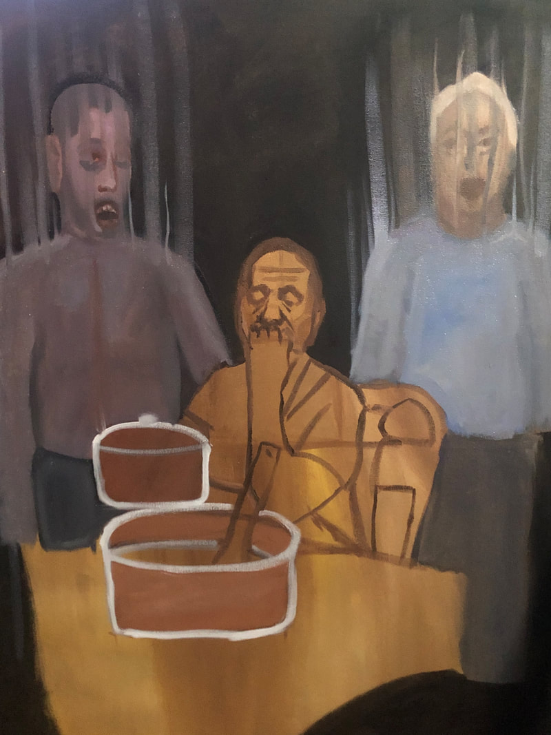
I thought that the composition in "Figure with Meat" from 1954 (bottom left), would be a good composition for my painting. I liked that the figure in the middle was sitting down and in a way, under the two pieces of meat that were next to the figure on either side. I thought that I could have someone I know that's impacted by machismo in the middle and two authoritative figures in their life. By then, I already knew I wanted to use my grandmother and my grandfather along with their son for this painting. This composition would be a good way to show how women in Mexican culture tend to be put under men in relation to power and what they had to say, the ability to voice their opinions. I also wanted to add the lines from Innocent X (referenced above) to the men in order to create a distorted view of them because they seem to be full of emotion towards women that that's mostly what I see when they speak to my grandmother.
"Study for a Head" from 1952 (bottom right) seemed like a good expression for the two figures on either side of the main figure referenced from "Figure with Meat" to show the uneasy and emotional aspect of machismo (bottom left).
"Study for a Head" from 1952 (bottom right) seemed like a good expression for the two figures on either side of the main figure referenced from "Figure with Meat" to show the uneasy and emotional aspect of machismo (bottom left).

|

|
Artist in Focus: John Singer Sargent
|
John Singer Sargent was an impressionist painter who also partook in the American Renaissance movement. His artwork has a very soft aspect to it, which gravitated me towards it. The colors of the figures in his portraits pop due to the dark backgrounds. There is an emphasis on the faces of the figures in his portraits due to the dark backgrounds and how he sometimes made the clothes more "messy" and less detailed than the faces of his figures. "The Head of a Capri Girl" (to the right) encapsulates style this well.
Another portrait of Sargent's that grabbed my attention was the one below titled "Leonard Wood" (1903) where the clothes are still more simplified than the face but they still look detailed enough where they complete and compliment the face. Once again the dark, but not black background brings attention to the figure but also a sense of softness that makes this portrait look welcoming. The shadows aren't as dark as the background either and the values are dark enough to be shadows without being overwhelming to look at. The highlights are something that I find interesting about both of the "Head of a Capri Girl" and "Leonard Wood". Although they're not pure white they still look very bright due to the background's value and hue. |

|

|
The painting that really inspired this painting was "Portrait of Mrs. Raphael Pumpelly" from 1887 (to the right). The woman reminded me of my grandmother and the look that the woman gives in this painting makes you feel captivated to keep looking at it. This is the effect I wanted to create with my own painting so I used this as inspiration for the effect.
Some other things I like about the portrait is the little blue button that pops with vibrant color. I knew I wanted to include a couple things in the painting that would do that to attract attention but also include more of my culture being represented in the painting. |

|
Planning
I was taking pictures of everything I could in preparation for this painting because at first I didn't know what I was going to make my painting about. I ended up taking these three pictures of my uncle, my grandmother, and my grandfather. From then on, I knew that I was going to make my painting about how my grandmother is impacted by uncle and grandfather's machismo. I know that there are many (especially older) women in the Mexican culture that are impacted in a negative and belittling way by the other Mexican men in their life, even if they are family.

|

|

|

|

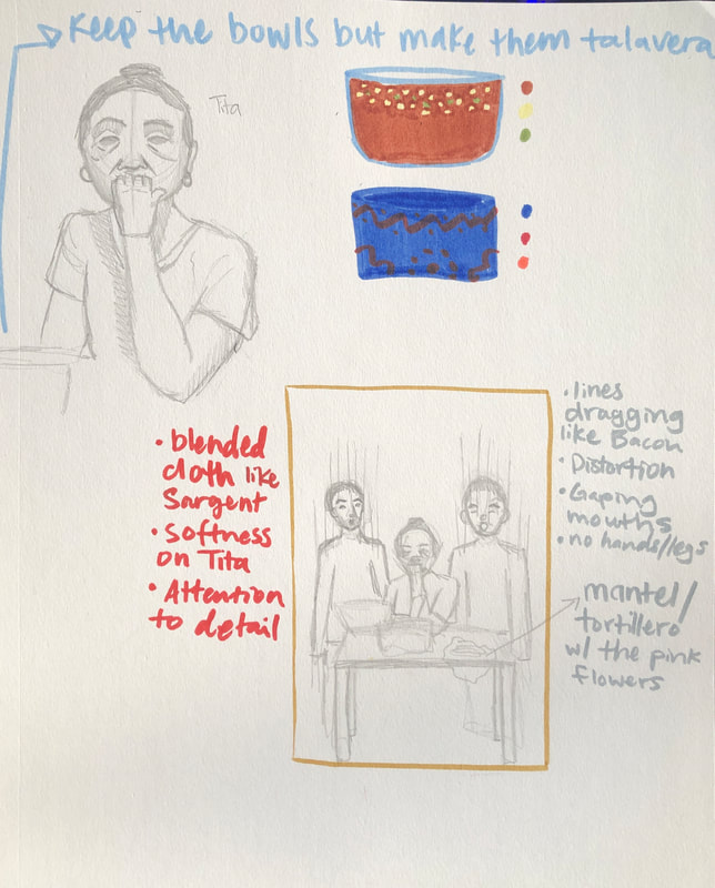
For Tita, I knew that I wanted her to be in Sargent's art style so that she could be seen as beautiful. Sargent's style would be able to make this possible because of how delicate and soft his style looks.
I wanted Tita to look this way to contrast with the way that the men would look like. She looks calm but also so tired. You can tell that she's been through a lot due to her eye bags that show that she's tired but also her deep smile lines that show that she still has been very happy throughout her years. I think that women like her should be admired more and looked up to. Sargent's style was a good choice for my aim and metaphor that I wanted to portray. |
I knew exactly what I wanted to do for this project and I didn't know how to put it into a visual. That was a difficulty for me when making the planning of this painting but I tried to at least get some sketches and some simplified faces for the people I was planning to have in the painting including my uncle, my grandmother, and my grandfather.
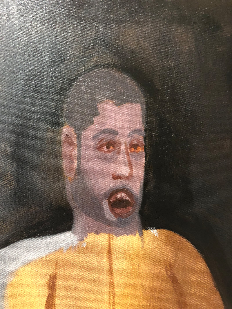
For the composition, I knew I wanted to use the one from "Figure with Meat" from Bacon, so that's where I started. Next, I knew that I was going to have my grandmother be in John Singer Sargent's style in order to contrast with Francis Bacon's style that I was going to use with my uncle and grandfather. The messy and expressive art style of Bacon is meant to personify the emotions that my grandfather and uncle constantly show my grandmother, Tita. There would be gaping mouths in the male figures like in Bacon's "Study for a Head" from 1952 to show that feeling of anger being released from the men. This would also be meant to make the viewers feel discomfort from the men because of the gaping mouths and distortions that would come with the lines. I did see some challenges that I would be facing for example not having references of the males figures standing up so I would have to improvise and hope for the best. Another challenge was going to be trying to get Sargent's style down but I knew that I could at least practice that, so I experimented with oils. |
Experimentation
To experiment, I wanted to practice making skin tones and practice using the oil paints since it was a new medium that I was going to be using. I wanted to see different ways that people tried to replicate the Sargent art style and so I watched some videos on YouTube to help guide me. I thought that it would be valuable to practice making a quick couple-hours-long portrait. I practiced by making a sketch on canvas and trying to follow the videos and listening to the artists' tips on the painting process. I opened up "Eleanora O'Donnell Iselin" by Sargent on my computer and tried to replicate it, taking into account the advice the artists gave.


|

I forgot to take pictures of the process of me getting the outline of the face but the skin tones were the next thing I wanted to get down right away. I looked for shadows and redness in the face of the original portrait and added them in the places that looked close enough, since I just wanted to get an idea of where those things would be placed. I knew that I could just adjust the piece later on. One piece of advice I made sure to keep in mind while I was painting was to make sure that the eyebrows and eyes were slanting at the same angle, making parallel lines. The painting would look lopsided if this small detail wasn't implemented, hence the lines that I painted on the face in the first picture on the left. Then, I added the facial features and refined the shadows and redness in the face.
In the end, I think that this "replication" was a useful exercise to study the way that the painter paints along with watching an accumulation of YouTube videos showcasing the methods that worked best for the artists that were also replicating Sargent's work with more accuracy. |

|

|

|

|

|
Eventually, I decided that I needed to make another portrait so that I could get as much practice as I could before I made my final painting using a reference that a friend provided for me, one of her own photos.
I started with making an outline of the face and hair with some burnt sienna thinned down with linseed oil along with some shadows that I saw in the reference photo. Then, I added some base colors to the painting for the skin and hair but I made sure to leave the shadows there so I could see them later. After that, I added more to painting and tried to define the features a bit more and make those features darker. Lastly I added details like shadows and highlights. I also realized that I had made the eyebrows to dark originally so I adjusted them to be a bit lighter in value. When I was happy with the portrait of my friend, I thought that I was at least a little more prepared to make my final painting so I began my process. |
Process
I started off by making my own canvas. To do this, I got two 60.96 cm and two 91.44 cm stretchers and put them together.
Then, I got a roll of canvas and selected an amount that would run around the perimeter of the base of my stretchers and have an overhang of about 8 cm. I cut the canvas, laid my stretchers on the canvas, wrapped the canvas around the edges of the stretchers (below second from left) and began to staple the canvas onto the stretchers with a staple gun (below most left). I made sure to keep some overhang so I could adjust it later on as I needed to. I left the corners for last. I had a different process for the corners: to get the corners stapled I had to fold them in a way that wouldn't make them visible to the viewer (below second from right). I trimmed the overhang and the picture on the most right was how the canvas looked after that.
Then, I got a roll of canvas and selected an amount that would run around the perimeter of the base of my stretchers and have an overhang of about 8 cm. I cut the canvas, laid my stretchers on the canvas, wrapped the canvas around the edges of the stretchers (below second from left) and began to staple the canvas onto the stretchers with a staple gun (below most left). I made sure to keep some overhang so I could adjust it later on as I needed to. I left the corners for last. I had a different process for the corners: to get the corners stapled I had to fold them in a way that wouldn't make them visible to the viewer (below second from right). I trimmed the overhang and the picture on the most right was how the canvas looked after that.

|

|

|

|
|
Then, I gessoed my canvas with two layers of it. The gesso was applied with an old brush with brittle bristles. I brushed it onto the canvas using long strokes going horizontally, which I later learned, wasn't the best look that the canvas would get and I kept that into consideration for following projects. After the two layers of gesso, the canvas looked like this (to the right).
|

|
|
Then I began to paint the canvas with a warm toned background using a thinned down burnt sienna and cadmium yellow. I did this to prevent me from making paint that was too light later on. If I were to use a plain white canvas, the colors would appear to be brighter compared to the brown paint mixture I had on the canvas at this point.
After this I got a projector to help me transfer my pictures that I had taken of my family members (pictured below) onto my canvas. |

|
|
|
|
|
|
After some difficulty in trying to get the pictures positioned correctly, I made some outlines of the faces and hair using burnt sienna (bottom right in the collection of pictures). I improvised with the bodies later on which wasn't the best idea as it made the male figures look two dimensional instead of three dimensional. Luckily, the woman figure ended having a bit more depth.

The process for my grandmother was going to be similar as I was going to paint another face but this time I had to pay attention to fabric and the details on her shirt that I'd have to replicate.
I started with painting her shirt to get what I thought was going to be a challenge for me out of the way. I ended up liking the results almost right away and the key to this was using a round brush to soften up the shadows in the creases of the shirt. One thing that I did later in the painting was get rid of the second smaller pot that was unnaturally placed for the angle the viewer would see this in as seen to the bottom right, with the pots outlined in white. I added a smaller bowl onto the table instead of the pot. I put cultural foods in both the pot and the bowl to be representative of my culture. Looking back, I would've added a main dish or a plate of food. 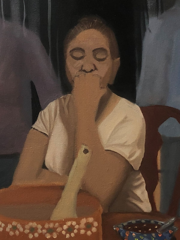
|
Then I decided to paint the men and background. My uncle painted in purple and my grandfather in blue, inspired by the colors in Bacon's work. I decided to have both their skin and their clothes the colors that I chose for them. The men weren't looking detailed or clean looking which was good in my case, since I was using Bacon's style for them. I used the same process I used when I was painting my friend. I outlined them and got shadows laid down. Then I added a base color and worked my values either to be more or less vibrant or bright. Then I painted the clothes and lines streaking down their faces.
|


|
Finally, I revised the painting and added a couple more finalizing details like the tortillero which is a cloth that typically holds tortillas when they're warm and have sleeve to put them in most of the time. My family doesn't use those and rather just uses woven yarn to hold our tortillas (to the right). This is what the painting ended up looking like to the far right.
|

|
|
Critique
|
|
|
|
|
Some similarities between my work and that of Francis Bacon's are the composition and use of line. The composition in both "Figure with Meat" and "Tita" include a figure in the middle that is sitting down and two figures standing on either side of the main figure. This gives the painting movement of focusing The dark values in Bacon's work are reflected in mine in regards to the background and I think that it was very beneficial to do that since it doesn't distract from the . The use of line is also reflected in my work. This is seen through the lines that cut through the two men in my painting. I was excited for this part of the painting process because I was able to distort it, which is something I had never done prior to this. The possibility of distorting my painting was very fun to me because I was able to manipulate the paint in a way that was destructive to the piece. In addition, there are similarities in the use of color between our works. We both used blues and purple in the face and for clothes.
A difference between my work and that of Francis Bacon's are the subject matter of the paintings. His "Figure with Meat" has a figure in the middle with two pieces of meat hanging on either side of the figure. While "Tita" might have a similar composition, there are three human figures in total. Another difference is the attention to detail in the pieces. I didn't spend too much time on the men's clothes contrasting with Bacon's work where although it's not the focus of the painting, he still adds those details of depth.
A difference between my work and that of Francis Bacon's are the subject matter of the paintings. His "Figure with Meat" has a figure in the middle with two pieces of meat hanging on either side of the figure. While "Tita" might have a similar composition, there are three human figures in total. Another difference is the attention to detail in the pieces. I didn't spend too much time on the men's clothes contrasting with Bacon's work where although it's not the focus of the painting, he still adds those details of depth.
Francis Bacon
John Singer Sargent
A similarity of Sargent's work and mine is the look of the softness of the figures in our paintings. There were some challenges with getting this look and I think that it was because I wasn't blending as often as I should've but there were some qualities of that style that still made it look similar like the blending on the sleeves of my grandmother. The portrait of Pumpelly has a dark background, just like my painting. This makes colors look brighter than they are and draws attention, also similar to the portrait of Pumpelly. Another similar aspect that my painting has compared to Sargent's is the blue button that the woman has was the tortillera and the blue bowl. These parts of the painting also bring attention to those specific objects of the painting and it worked in my painting and the message I was trying to convey as those objects related to my culture.
A difference between Sargent and I's work is the way that the woman figure captivates the audience. In my opinion, I think that the two men in my painting are the attention grabbers due to their distortion and color. They seem so out of place compared to the realistic looking grandmother. Another difference is that there is only one figure in Sargent's portrait while there are three figures in mine. There is also the obvious distortion in my work compared to Sargent's. Sargent's work is impressionistic while mine is abstract in part of the painting.
A difference between Sargent and I's work is the way that the woman figure captivates the audience. In my opinion, I think that the two men in my painting are the attention grabbers due to their distortion and color. They seem so out of place compared to the realistic looking grandmother. Another difference is that there is only one figure in Sargent's portrait while there are three figures in mine. There is also the obvious distortion in my work compared to Sargent's. Sargent's work is impressionistic while mine is abstract in part of the painting.
Reflection
Overall, this painting was an intimidating task for me at first since this was the biggest painting I’ve made so far. The idea of also painting a person somewhat realistically was intimidating but I thought that it was a good challenge for me considering that I never did that before. I came into this project feeling very scared and incapable but as time went on I realized that my skills were growing with every time that I practiced and gave some effort to making any action towards finishing this project. I feel that my skills developed so much during this project and making it happen was actually a fun experience for me. Something that was challenging for me during this was using the projector in order to get my pictures onto the canvas. After that, I thought that I was doing pretty good with getting the fabric painted for my grandmother and I found that I like painting fabric. Something that I wish I did differently was how I painted the bodies of my uncle and grandfather, I wish I had a better reference that I took myself for that so that they’d look less two dimensional. Also the “tortillero” that holds the tortillas, I wish I made some revisions to it to give it more depth and had an actual reference from my family instead of trying to remember what they looked like. I think that fixing these things would make me more satisfied with the end result. Along with the tortillero, adding more culturally relevant decorations to the background may have been good to convey to people that this is about Mexican culture. At the same time, Francis Bacon and John S. Sargent didn't have anything in their backgrounds when they made portraits a majority of the time, so I think that either way would've been fine. This painting reminds me that there is always room for improvement and that you should push through when you have challenges in front of you. Perseverance was a big factor when it came to this project in addition to having to trust the process. I'm looking forward to making more paintings but I know that I'll have to work on my time management for future paintings.
Connection to ACT
1. Clearly explain how you can identify the cause effect relationship between your inspiration and its effect on your artwork:
The quality of distortion in Francis Bacon's works along with the soft look that John Singer Sargent's work contrasts with one another in order to make the feeling of uneasiness be possible. The contrast reflects the message I'm trying to send: the machismo in the Mexican community is often overlooked and it gets ugly, like the two males figures, leaving the women in the household strong and unfazed which are qualities that I think are meant to be admired and respected more than they are, hence the soft quality of the woman, bringing an emphasis on her.
2. What is the overall approach the author has regarding the topic of your inspiration?
Francis Bacon evokes emotions in his paintings, meant to also impact people in a way where they feel an emotion towards his paintings, too.
3. What kind of generalizations and conclusions have you discovered about people, ideas, culture, etc. while you researched your inspiration?
I realized that there weren't that many white artists that painted brown people, so it was difficult to find an example of how they would be painted like. Even with thousands of other references with white people, it still feels good to see representation of brown people in praised white artists' work.
4. What is the central idea or theme around your inspirational research?
The idea of my inspirational research was to find a distorted looking style of art in order to evoke a feeling of uneasiness, which was found with Francis Bacon.
5. What kind of inferences did you make while reading your research?
I came into my research thinking that I wasn't going to be able to find examples of brown people in John Singer Sargent's work. I was surprised to find that
MLA Citations:
1950s | Francis Bacon. (n.d.). https://www.francis-bacon.com/artworks/paintings/1950s
Sargent, John Singer. “Portrait of Mrs. Raphael Pumpelly - John Singer Sargent.” Google Arts & Culture, artsandculture.google.com/asset/portrait-of-mrs-raphael-pumpelly-john-singer-sargent/nQHJR95vL44bjA.
“Head of a Capri Girl, 1878 - John Singer Sargent - WikiArt.org.” www.wikiart.org, www.wikiart.org/en/john-singer-sargent/head-of-a-capri-girl-1878.
Sargent, John Singer. “Leonard Wood - John Singer Sargent.” Google Arts & Culture, artsandculture.google.com/asset/leonard-wood-john-singer-sargent/5QEZCPlzx-On6g.
“Eleanora O’Donnell Iselin (Mrs. Adrian Iselin).” Google Arts & Culture, artsandculture.google.com/asset/eleanora-o-donnell-iselin-mrs-adrian-iselin/-wEjBB8SmU7DUA.
